

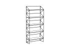
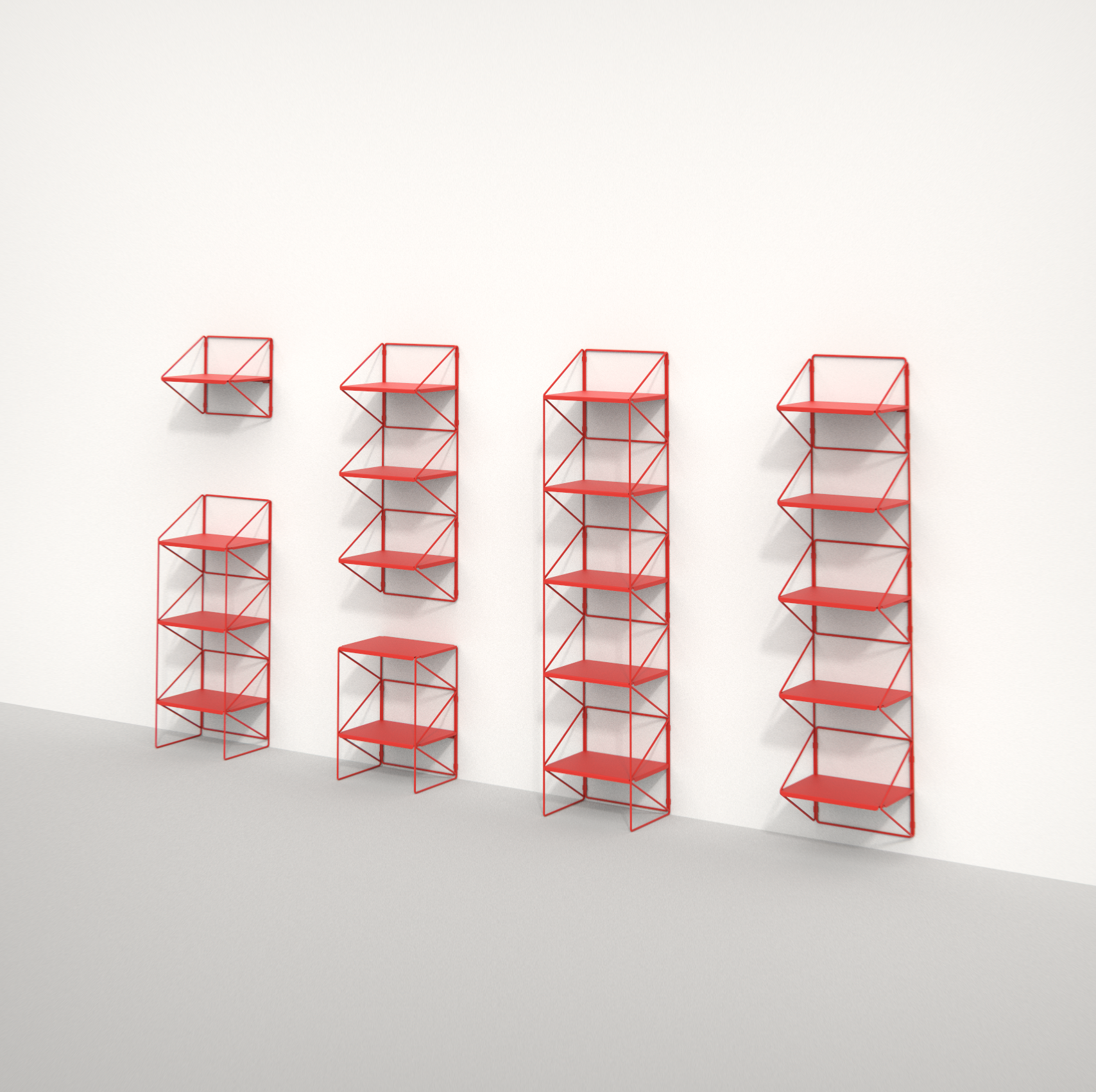
 Shelves and racks
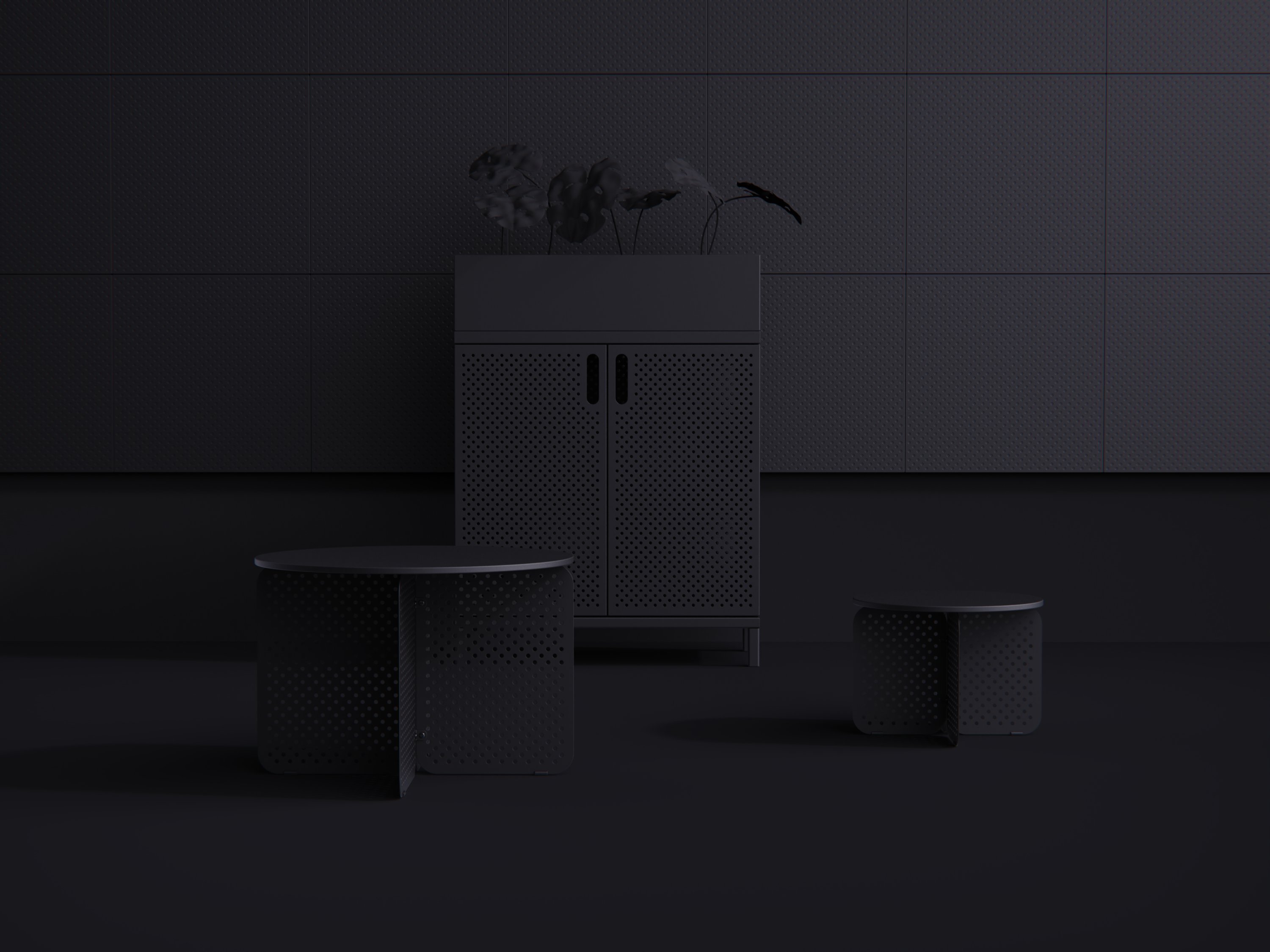
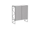 Designer cabinets
 Accessories
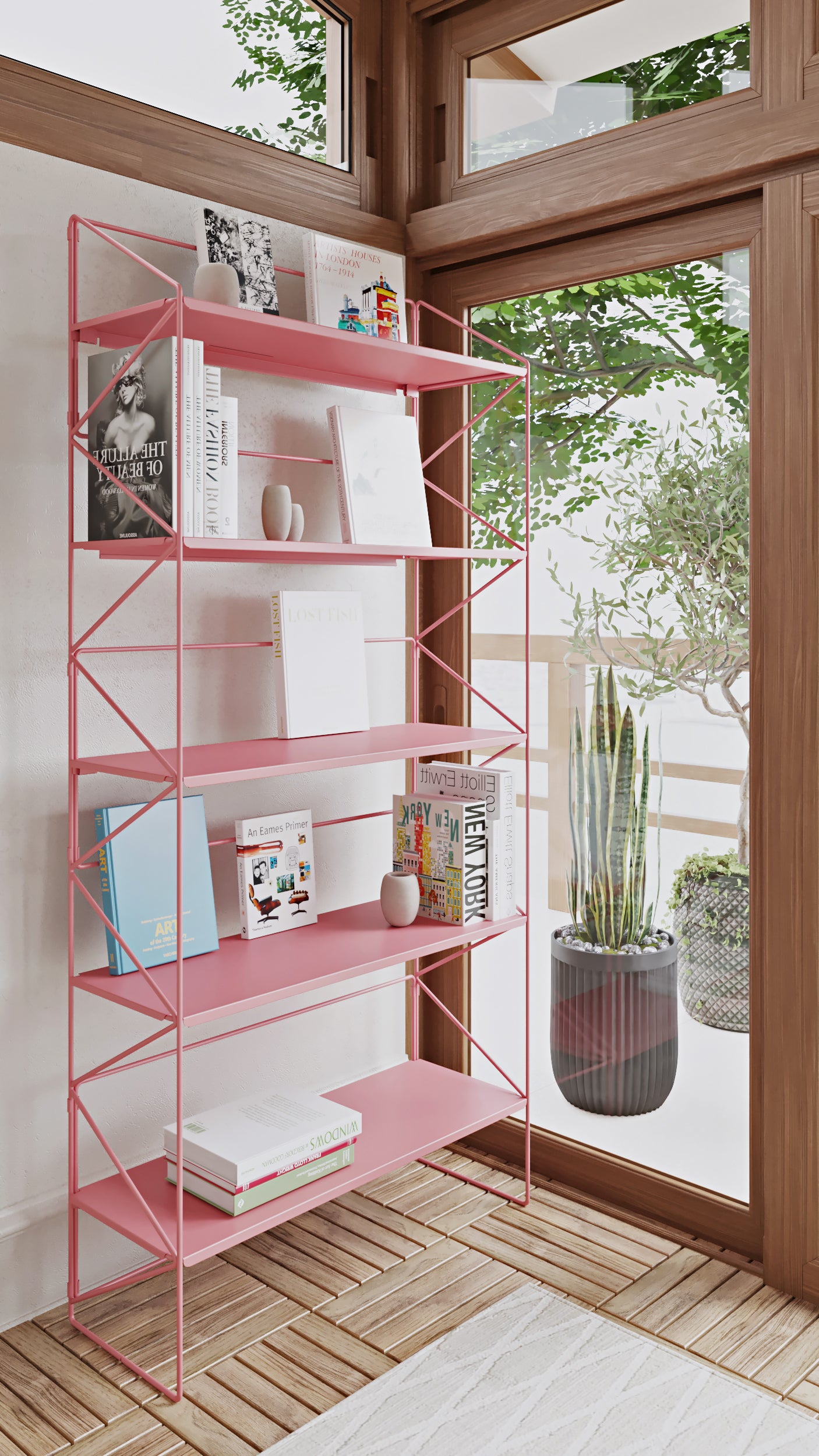
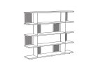 Bookshelfs
 Magnetic bulletin boards
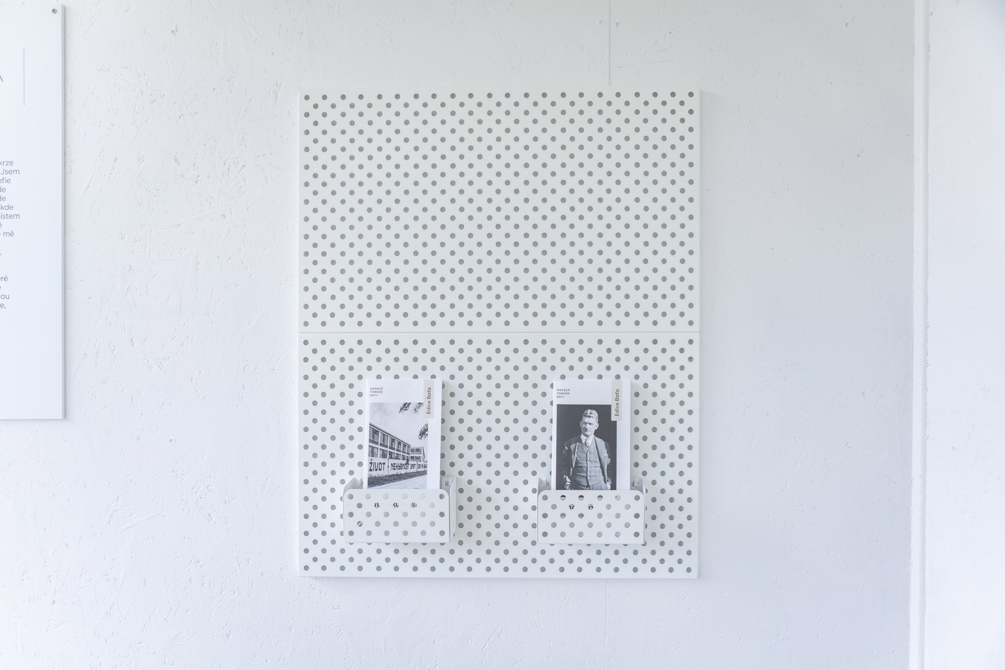
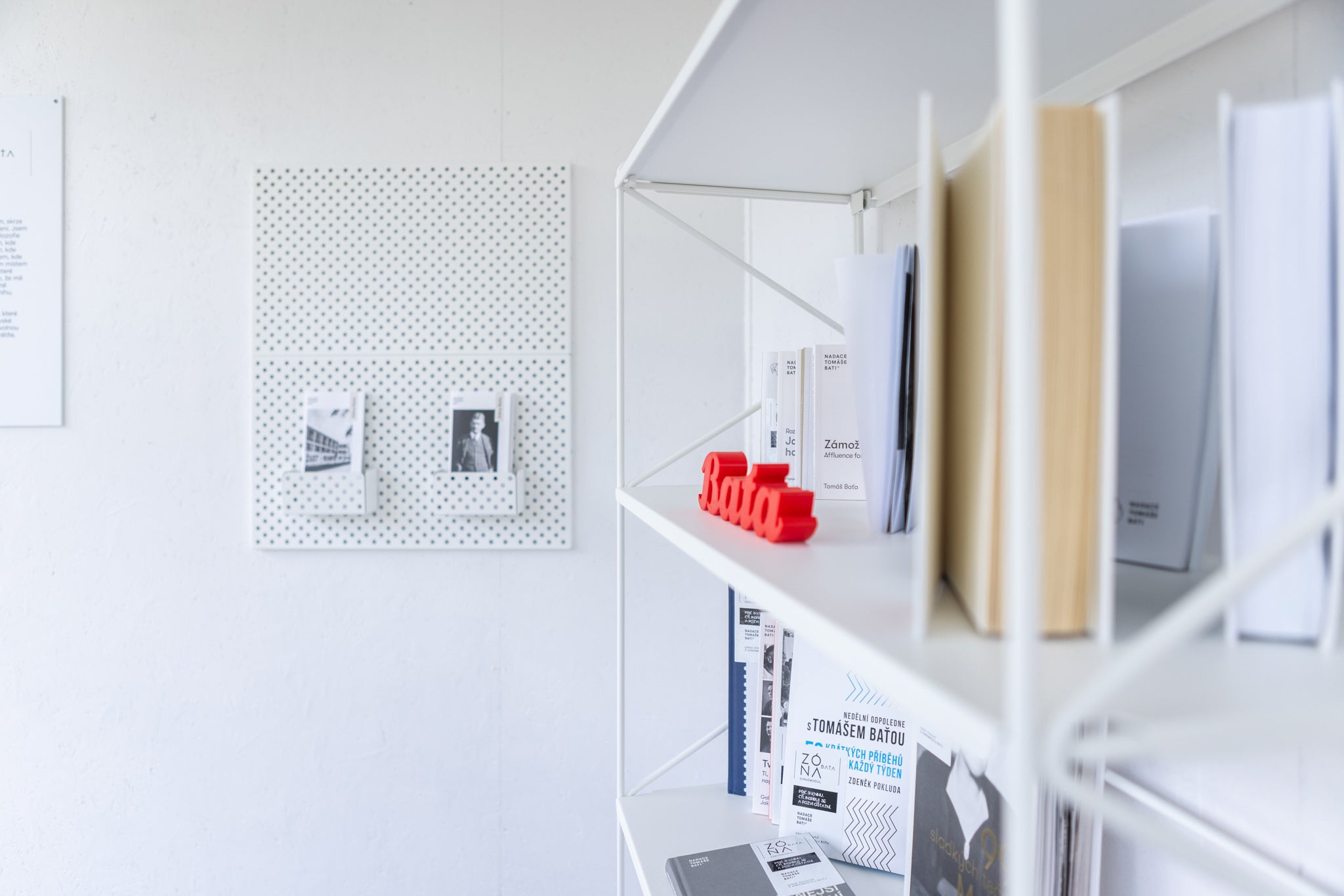
How did you find out about Fleysen and what attracted you to it?
First through social media and I immediately liked the furniture for several of our projects. With other furniture I had a problem that it was too repetitive, not exceptional or attracted too much attention. But Fleysen makes both the space and the displayed items stand out.
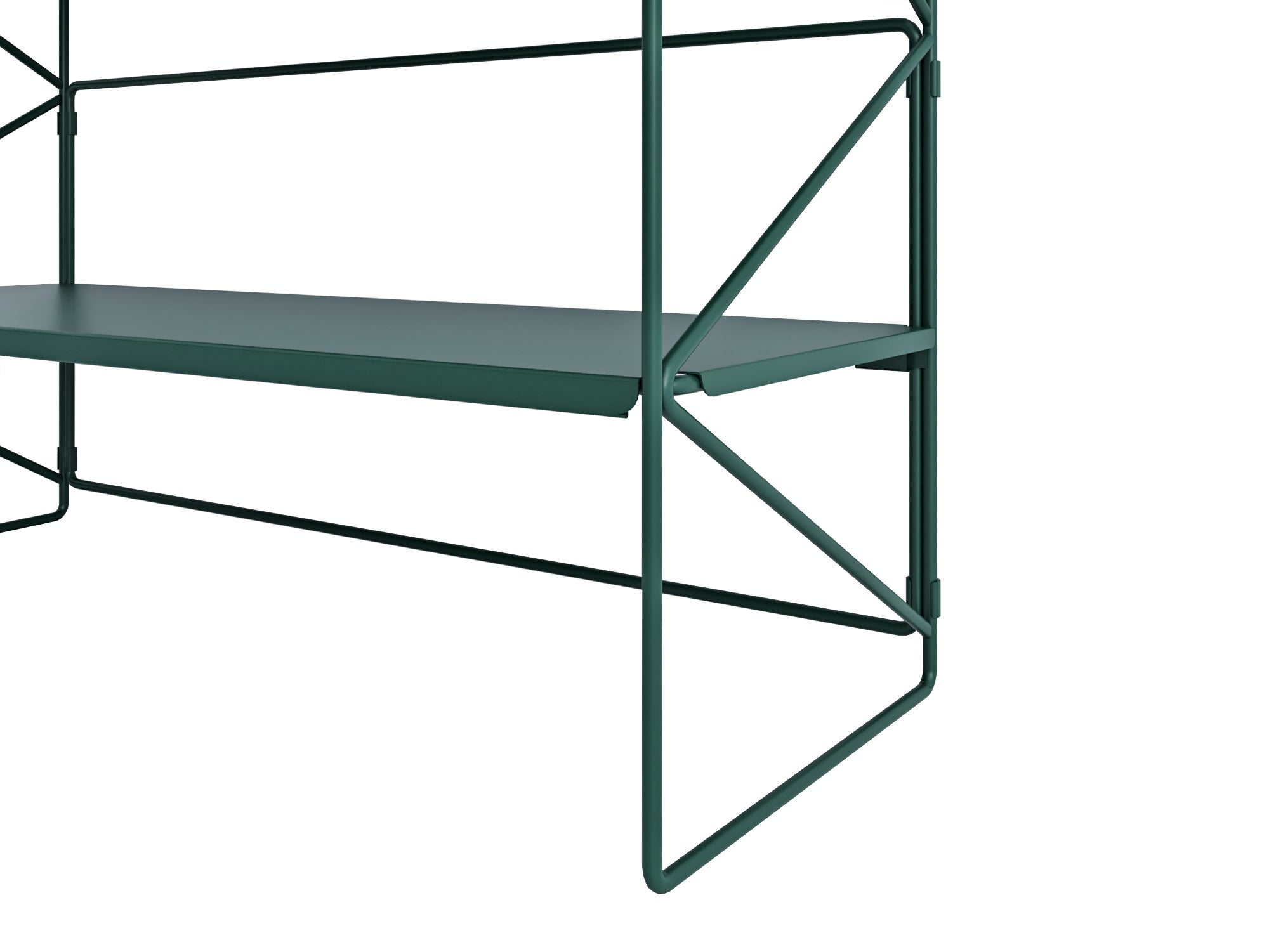
And then there's the Bata green, which I was drawn to from the beginning. Bata came up with this color by accident when he came to the workshop, it was a mess, and he said that's not how it is - that clean work cannot be done in a dirty environment, and he ordered everything to be painted white. The others didn't like the fact that white couldn't stay clean, so they compromised with gray or this light green. They're not as catchy, but they're still light enough to show any dirt, fingerprints, etc. Bata also loved green because it's calming and a symbol of nature.
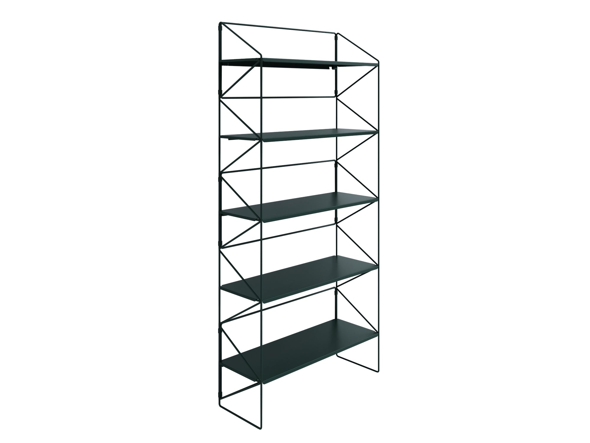
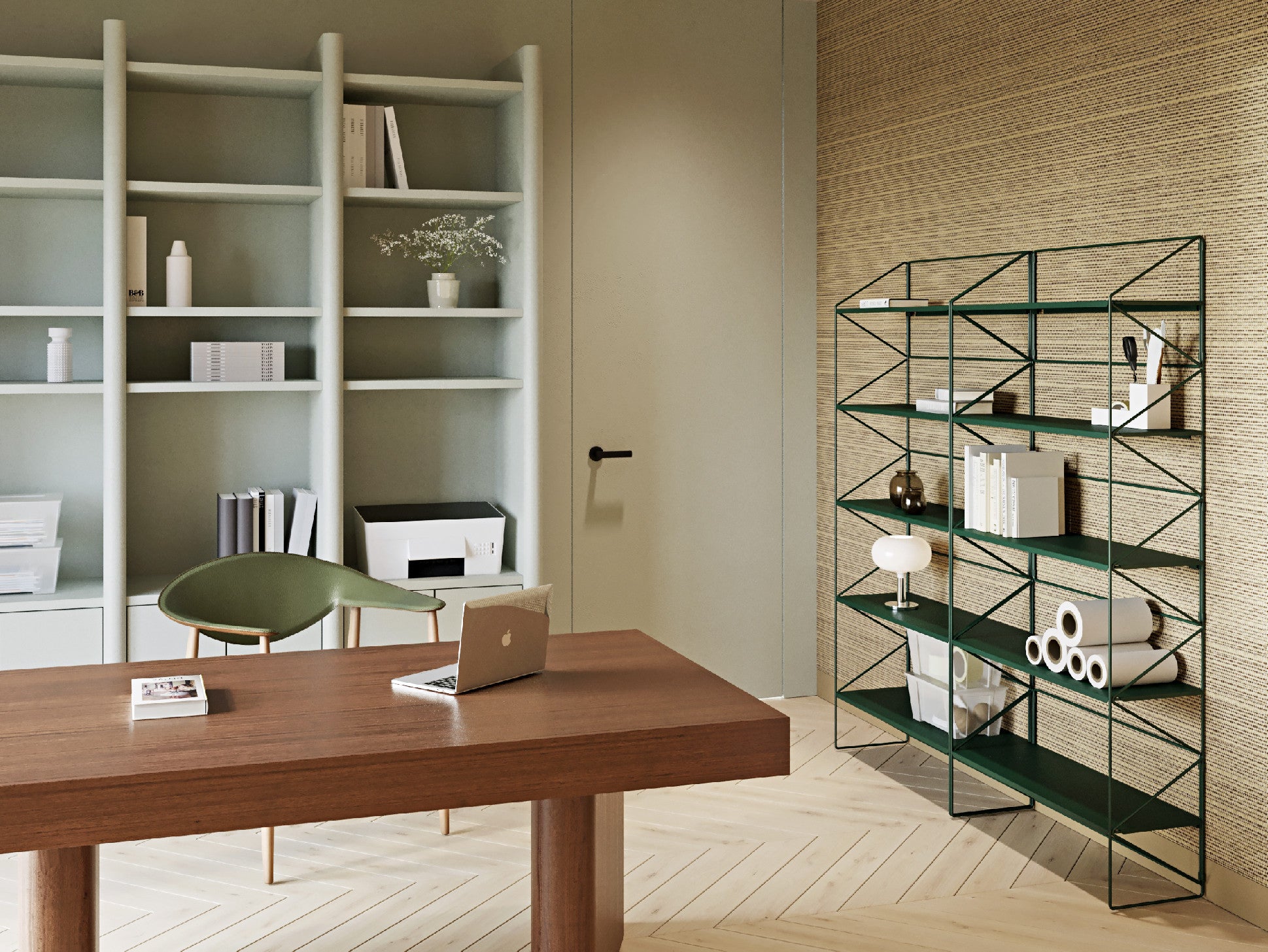
But the shelves aren't green after all...
They are not, there was a great temptation to put them here, but I had to follow the principle that it is not about satisfying the Bata ego, but about making the essence of the two modules and of course the displayed items stand out. Later, I would like Fleysen in the new offices, because since it is industrial and makes the space stand out, it does not clash with our period furniture.
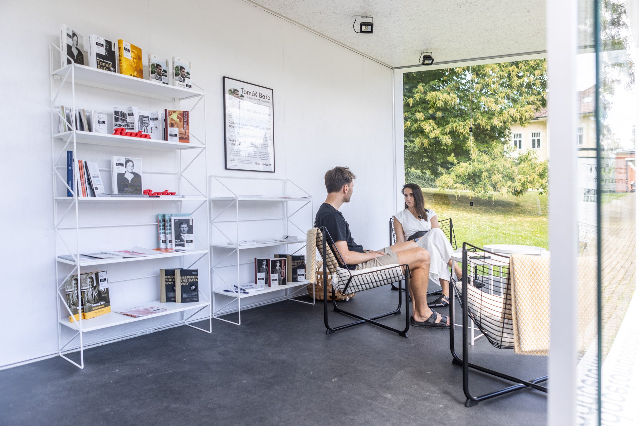
So Fleysen furniture will also be in the Bata villa built around 1910? How do such modern design and period space go together?
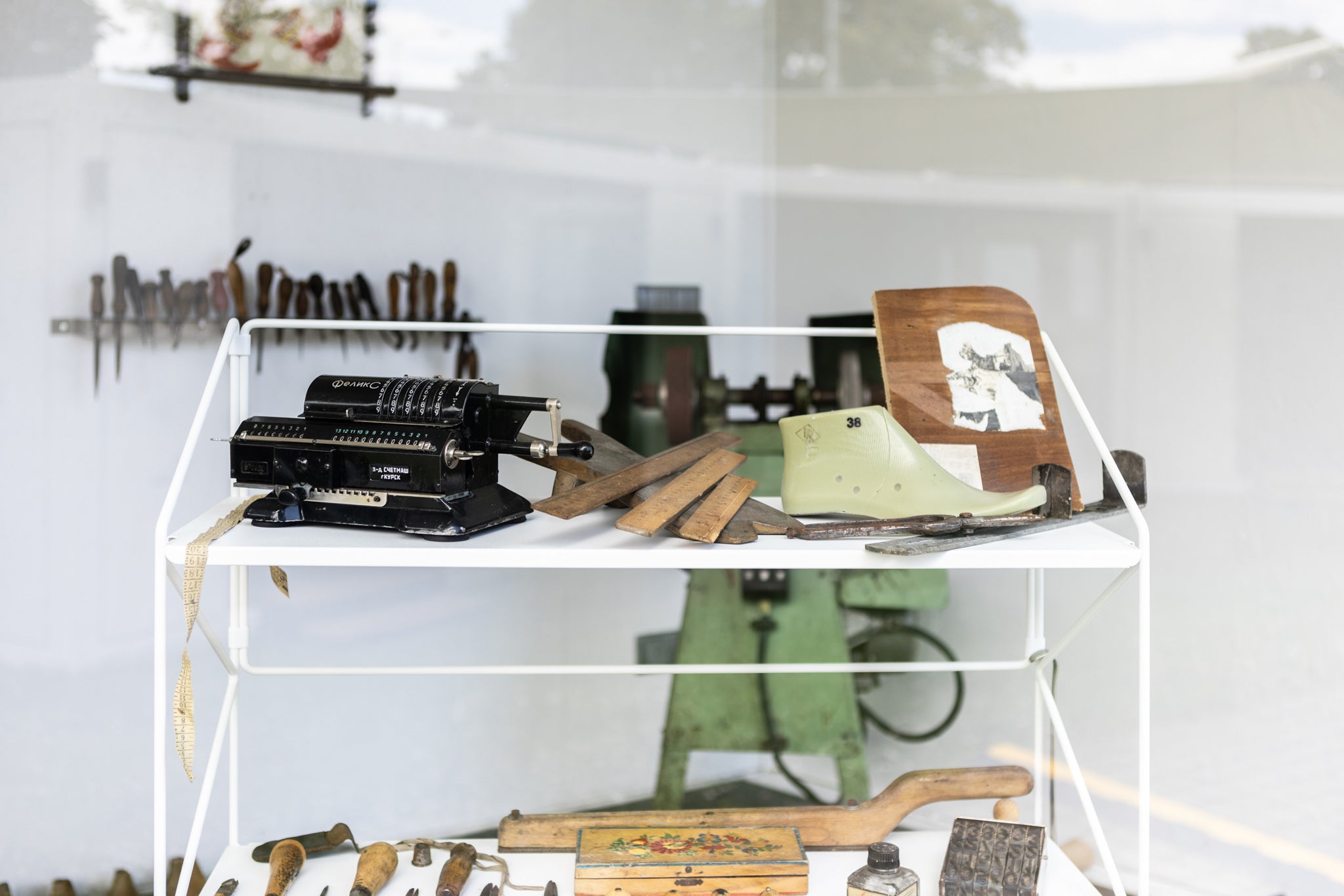
By the way, your shelf is very similar to the shelves that used to be in the Bata company, so it fits here stylistically and it's kind of stage number 2 for us. And there's a second level that I learned from the owner of Fleysen, Filip Dušek – Eric Päsold, the original owner of the factory in Plesná (the factory where all Fleysen furniture is made, ed. note), knew Tomáš Bata. That seemed completely iconic to me and I thought it couldn't have turned out any better.
Does it matter to you that the furniture is made of metal?
First of all, we just like the material, and Baťa's properties have often been compared to iron, concrete, and glass. It's also great how minimalist it is.
Back to the color, why did you finally decide on white?
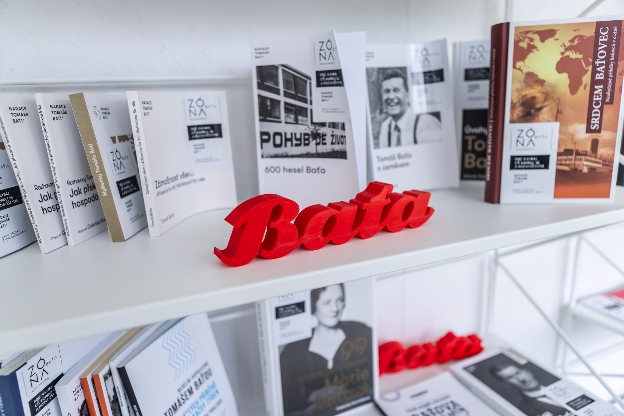
We were deciding between several “Baťa” colors. I was incredibly attracted to your red. Baťa loved it, for him it was the color of life, energy, blood… We were attracted to the aforementioned green, but also to dark blue, which is the color of the original Baťa logo… In the end, we decided that we couldn’t look for a Baťa color at all costs, but that the hooves had to stand out and that we wanted furniture that would blend in with the surroundings.
What do you imagine when you hear the word Fleysen?
Stability, tradition and great customer service. And also quality and a surprising number of options.
Gabriela Končitíková is the director of the Tomáš Bata Foundation, a lecturer and writer. She has long been dedicated to studying the legacy of Bata and is the author of several books on Bata. She has been working at the Tomáš Bata Foundation since 2016, and as part of her professional activities, she focuses on the possibilities of applying the Bata Management System to the current business environment.

The display includes white standing shelves #1210 and #1211 and a medium bulletin board #1732 .


Inspire others and share the article: