

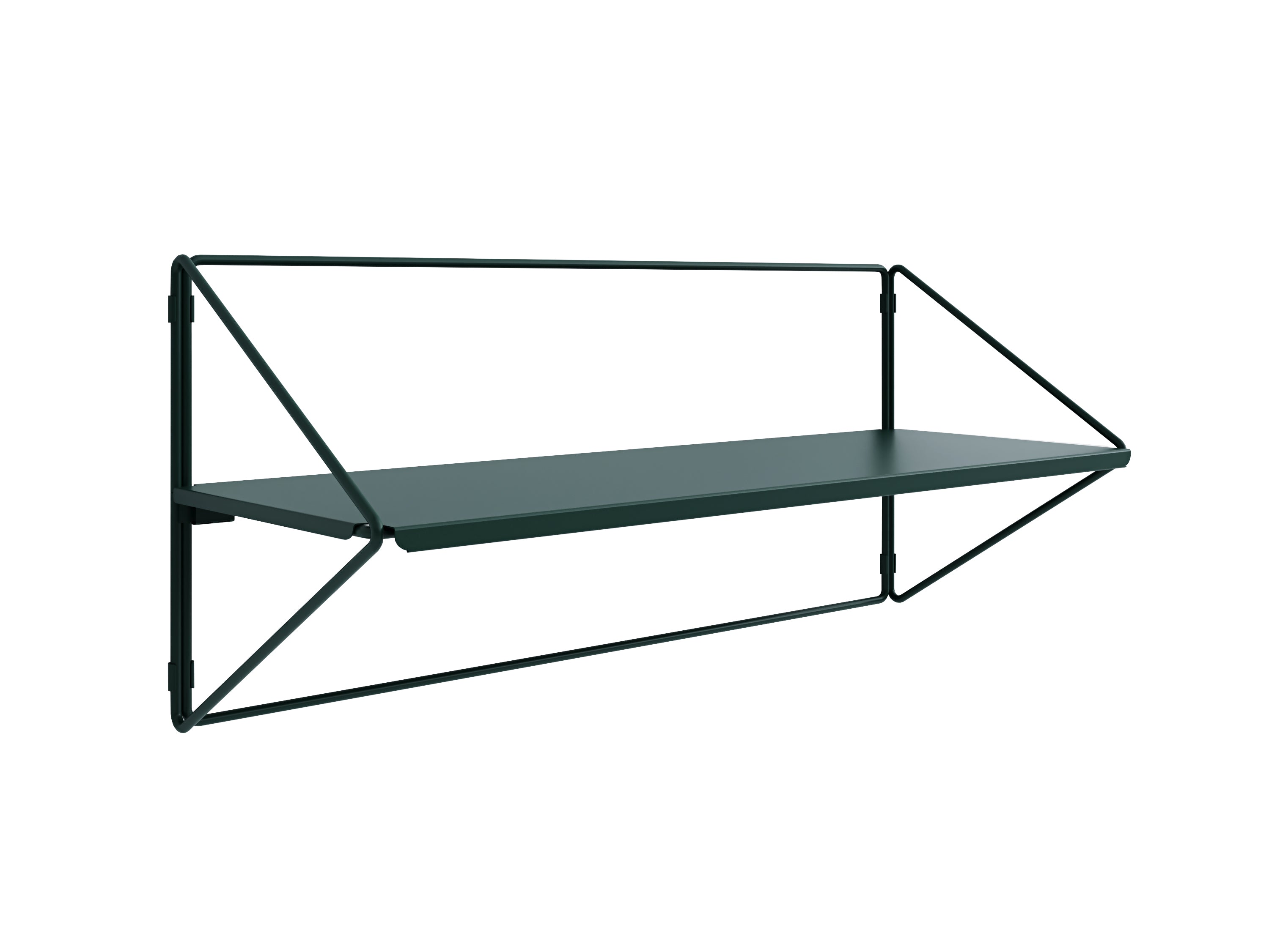
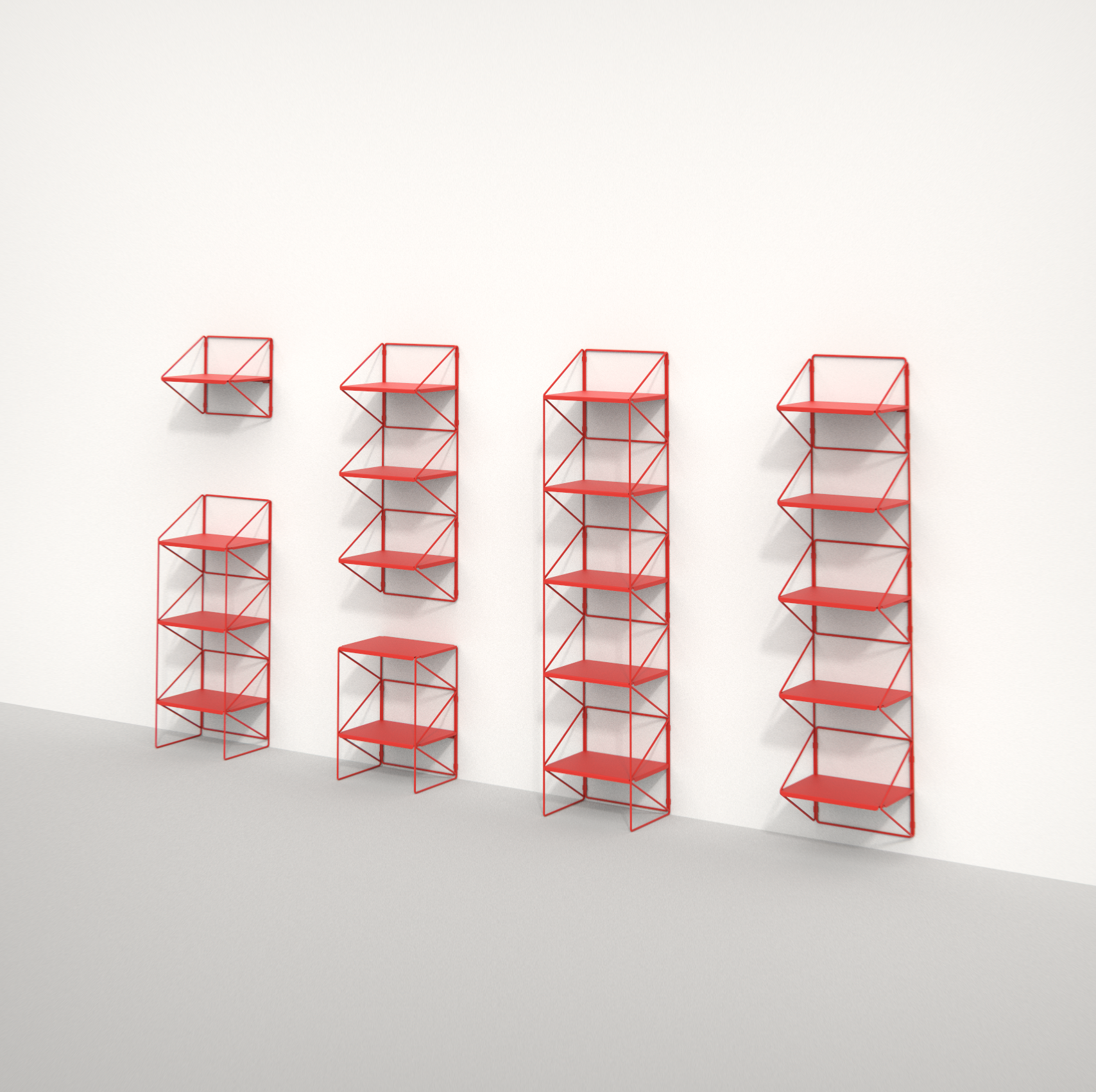
 Shelves and racks
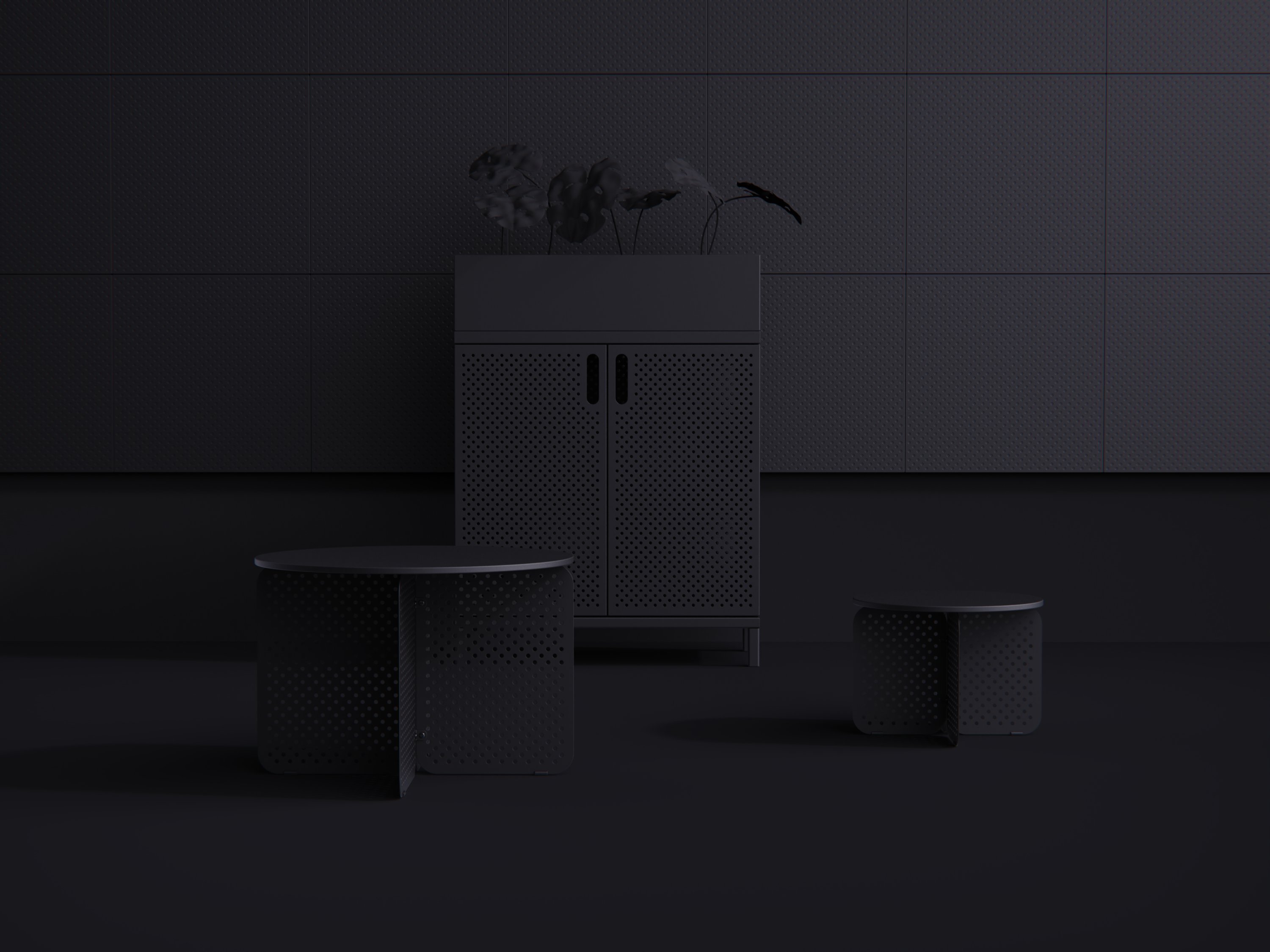
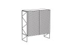 Designer cabinets
 Accessories
 Bookshelfs
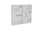 Magnetic bulletin boards
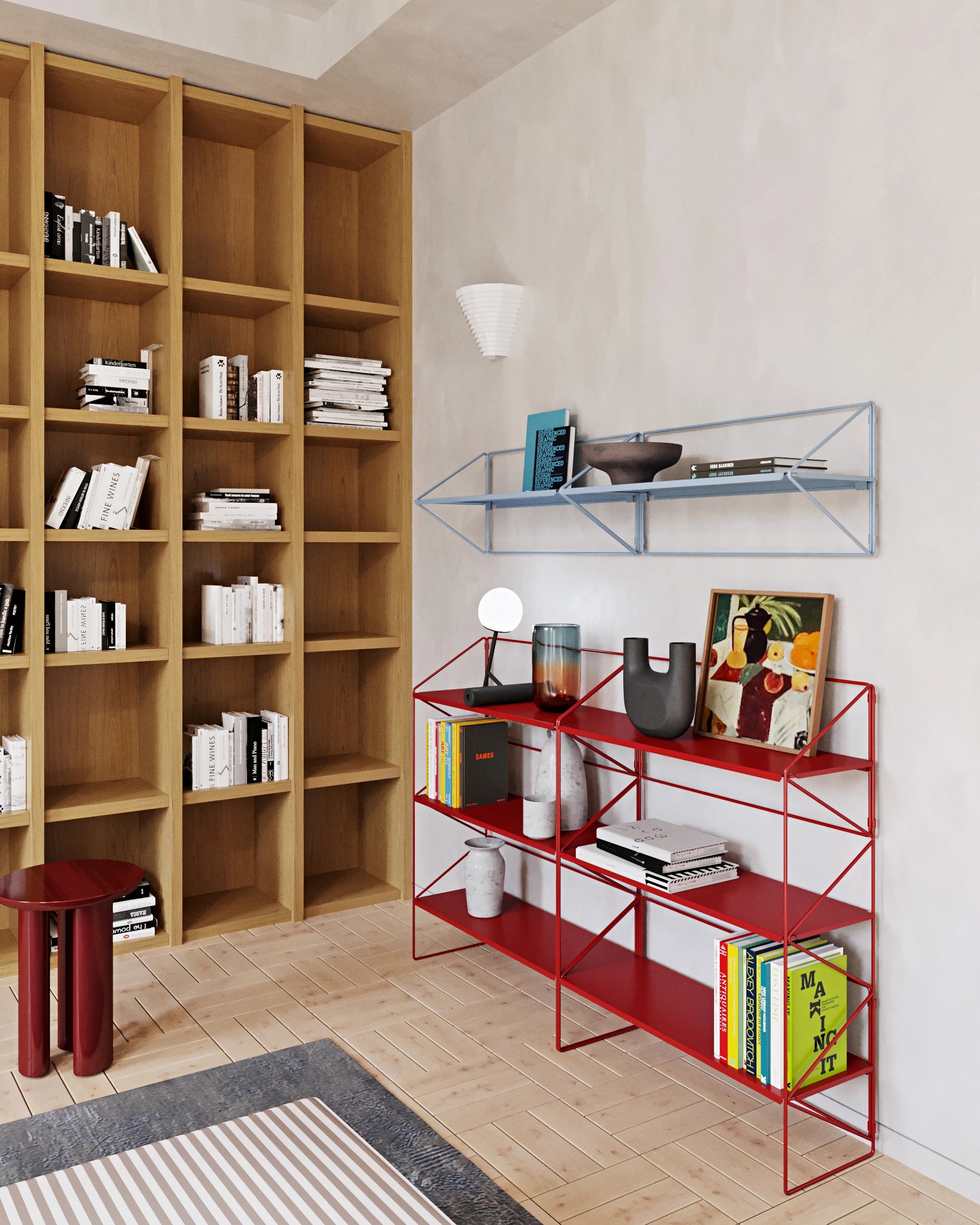


1. Be inspired, but trust your intuition
Start with inspirational Pinterest boards, talking to friends, and reading expert opinions . But stick to your personal preferences and simply eliminate any colors you don't like . You don't need to know why, your "likes" probably won't change.
2. Understand your space
The basic rule is – light colors will make a space appear larger, but can appear colder, dark colors will make a space appear smaller, but cozier . The size of a space is not just about the area, the height of the ceiling or the size of the windows is also important . You can afford more darker colors in a bright room . Also, watch the daylight – where it falls, which parts of the apartment need to be lit.
3. Shift into neutral
To prevent your home from becoming a marketplace, lay a neutral color foundation . Neutral colors are white, black, gray , and natural colors that we find in large quantities in nature - brown, beige, blue, green in the form of plants, and also old pink , which you can now find in our permanent offer . Neutral colors belong on large surfaces such as floors and walls , but you can also work with them on furniture. 4. Create a swatch book
You probably know that even neutral shades can clash with each other, especially when you want to add more expressive tones to them. Therefore, create a swatch book on which you can test combinations of colors, patterns and materials . It is ideal to give it time and gradually observe how individual materials and shades work together, where to subtract or add.
5. Buy significant items at once
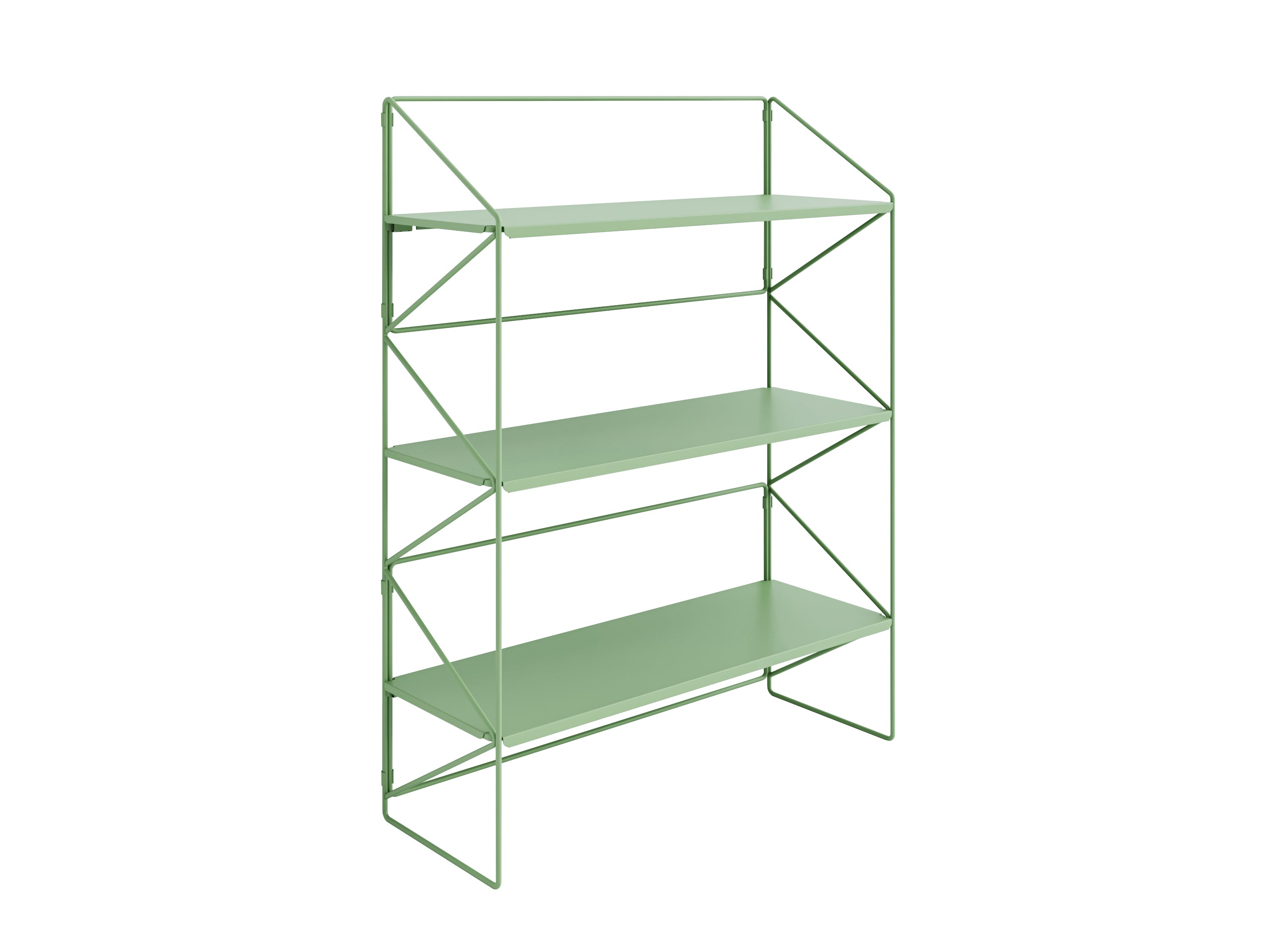
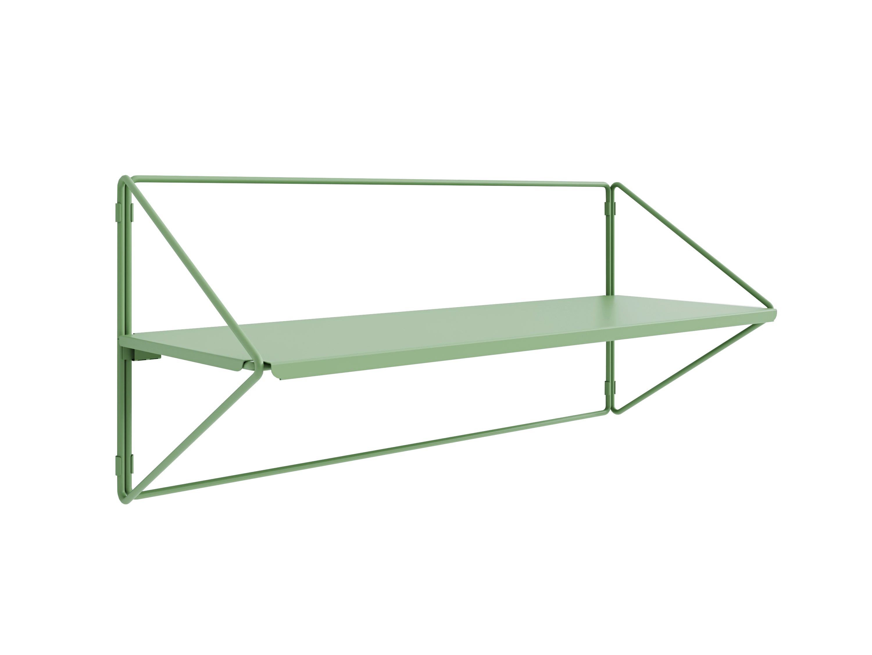
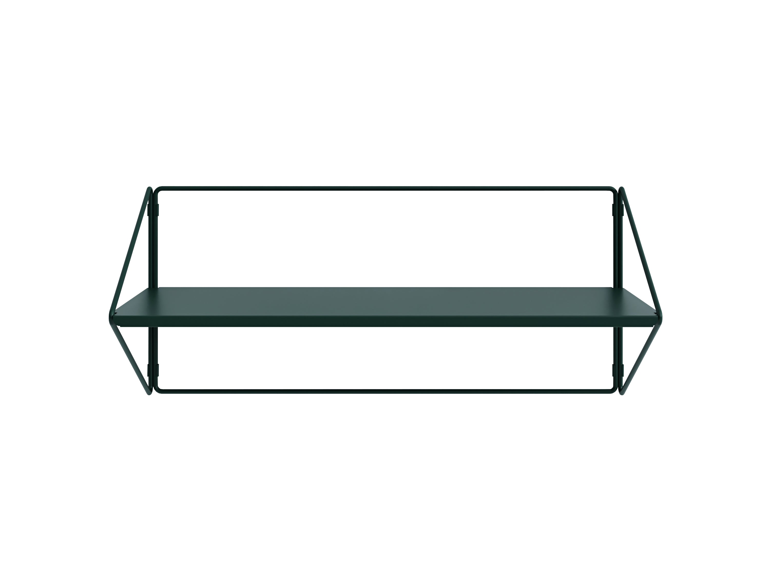
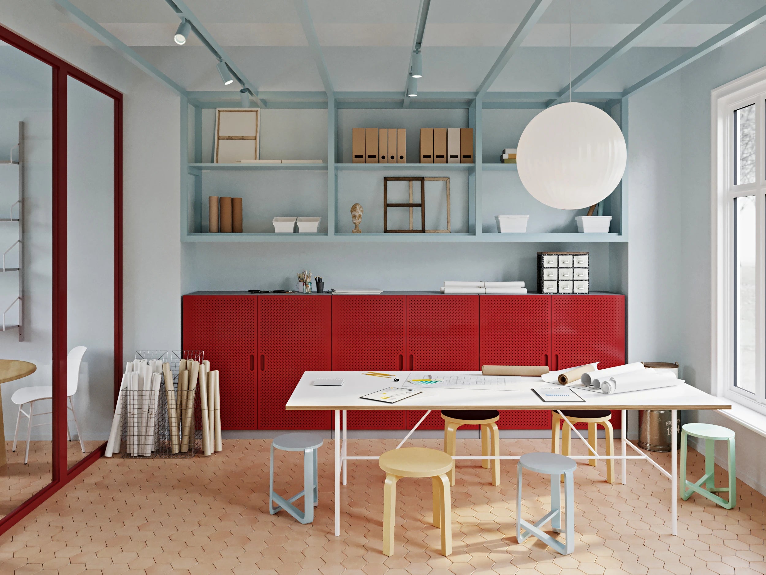
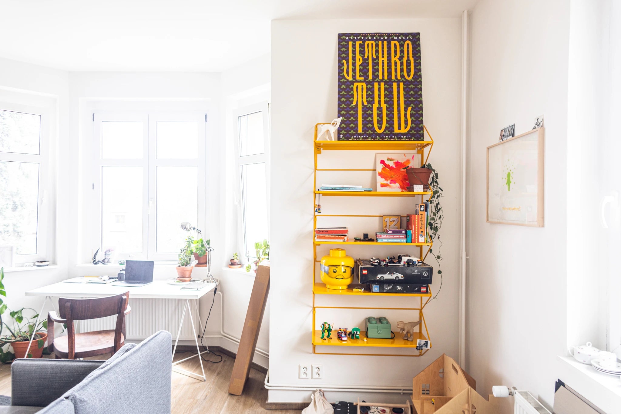
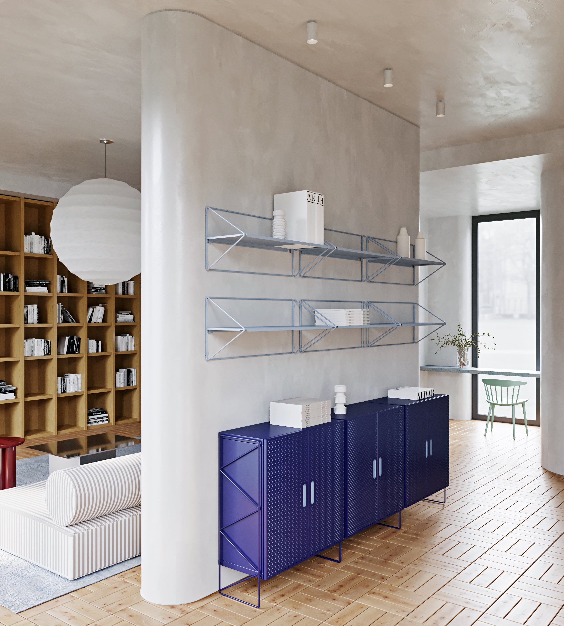
Choose the largest pieces of furniture together . When you buy pieces gradually, the concept of coordinating colors often falls apart. The bold colors of our cabinets and shelves should match the rest of your home, gray or black shelves will fit in almost anywhere. Smaller shelves or accessories can brighten up an uninteresting corner with their unmistakable color.
Color wheel theory
If you want to delve deeper into the idea of color combinations, you can work with the color wheel , designed by the German Bauhaus teacher Johannes Itten . The wheel consists of three basic (primary) colors - red, yellow, blue - then secondary colors , which are created by mixing the three primary colors in equal proportions - purple, green, orange - and finally tertiary colors, in which a primary and a secondary color are mixed.

Colors that are opposite each other on the circle are called complementary colors – they contrast significantly and are recommended to be combined together. Colors in an analogous scheme also go well together – those that are next to each other on the circle.
Saturation and brightness
Depending on the proportion of brightness a color has, it is light or dark (black has zero brightness, white has 100%). Saturation determines how strong the color is and is essentially how much gray it has in it. Only colors of medium brightness achieve full saturation.
So, when you add brightness and saturation to the circle, you expand the range of shades, but the complementary and analogous colors will still react the same way to each other. Plus, you add a new scheme, namely monochromatic colors - another combination that is great to work with .
Do you believe in colors?
Each one carries a different emotion and energy, although some meanings vary considerably across cultures. Of course, it also depends on how subjectively pleasant a given color is to you.
- Blue: calm, harmony, stability, wisdom, truth
- Green: relaxation, freshness, balance, health, renewal
- Yellow: sun, joy, wealth, safety
- Orange: creativity, enthusiasm and optimism
- Red: extraversion, sensuality, danger, intensity, power
- Pink: tenderness, softness, youth
- Purple: mystery, luxury, subtlety
- Brown: warmth, earthiness, comfort, security
- Black: elegance, minimalism, luxury
- Gray: neutrality, calm, easy to combine with other colors
- White: purity, neutrality, perfectionism, harmony
A few tips in conclusion
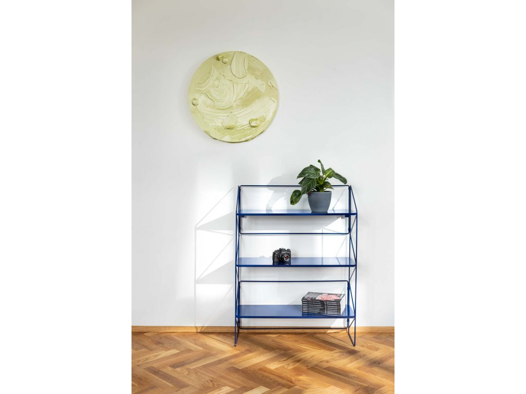
If you are afraid to experiment, stick to neutral colors and only introduce bold colors into the interior through accessories, textiles, and small pieces of furniture such as stools, bulletin boards , or our metal shelves .
In the beginning, you can decorate your home in two or three main colors .
Bold, rich colors combine well with pastels, rather than dark ones.
According to the theory of the circle , tone-on-tone combinations (monochromatic colors) , or different intensities of one color, analogous colors , i.e. those that are next to each other on the circle, and complementary colors – those that are opposite each other, work.


Inspire others and share the article: